
GNT with you
- Marcio Leite

- 16 de abr. de 2020
- 5 min de leitura
Project carried out by Globosat Art Creation' team in 2010-2011.
How a creative team of motion designers of a Brazilian pay tv company had faced the challenge of understanding deep user research data, translating it into design insights and themes, by learnings collaborative methods throughout design thinking process.

Design Research + Brand repositioning
The new GNT on air look is as result of a longsurvey taken within 25-49 years old Brazilian woman from AB classes. The channel has adopted a new programming structure that includes themes such as interior design, motherhood and relationship. Those where combined with previousthemes that the audience were familiar with - cooking, fashion, healthy lifeand news.
Our creative team received the huge challenge of repositioning a prestigious brand that has increased its value year by year, since it was launched in 1991.
The context
Contrasting to the clean and elegant 2008’ on-airlook, the new GNT channel identity should be designed to get closer toBrazilian modern woman. It means to get closer to an “A-B consumer-class-woman-30-years-old-professional-contemporary-and-mother”audience. Although they like very much the past on-air look, they didn’t feelrepresented by the image portrayed on it. Those models were far too much idealizedand perfects. In brief, the channel rebrand should consider these entire new modern woman attitude and her concerns about marital relations, motherhood, career, aesthetics, fashion and a healthy lifestyle.
Taking a design thinking approach to this project, for 3 months a group of 5 motion-designers were set in an improvised room, learning by practice several collaborative methods, all in order to co-create a very assertive solution to all those GNT challenges.
The process
The design elements and all branding conceptswere the result of a systematic design process of visual research.
The starting point was a series of surveys took across the country in different regions, and a deep qualitative research about Brazilian woman, all that conducted by a consumers insights team.
Then, the designers were asked to elaborate criticisms and organize all the information related to that audience understanding and giving focus to their specific anticipations and essential needs organising it in clusters.
From that clusters of information, they have learned how to create fictional personas that mostly represented the intended audience of that tv channel. That exercise resulted in five personas, every which had covered one of five different age and behavioural group of woman of the target audience.
Those personas were named by them as:
• Carols - 25 to 30 years old young professional/university student, urban woman;
• Gabrielas 25 - 30 y.o. artsy, independent, cosmopolitan, upper-class young woman;
• Fernandas - 30 to 35 y.o. married, with baby child, critical, analytical and social responsible vegan profile;
• Thaíses - 35 to 40 y.o. mothers of two, working class, emotional, intense, communicative, beauty-and-fit, sexy Brazilian stereotypes;
• Marlenes - 40 to 50 y.o., divorced, mother of young adults, rebuilding-her-life woman style.

Then, designers were asked to prepare individually an extensive visual research, accumulating all sort of visual references, photo filters, illustrations, scenes, collages, color pallets, and all sort of visualities related to their intentions. After that the group printed and organised all visual research in huge mood-boards, according to the three main themes: gastronomy, fashion, lifestyle.

Over each mood-board they had as drivers, a set of words collected from a trend report of Brazilian woman's consumer segment. Those words were used by them to create visual clusters, helping them to reach consensus on the team and an creating an art direction that could mostly better respond to the challenges.
Drivers: Real "in here" moments / Spontaneous attitudes / Intimacy on closeup details /
Beauty as daily routine / Relaxed / Joyful / Happy / Warm / Colourful / Intense and sexy.
The next step: they were asked to cross over the two initial outcomes: the set of personas and the mood boards. Than, they could map the visual style of every persona.
The results were five style guides that should be used to compose the art direction of the new on-air look.


The outcome
As visual solution, the team had understood that 3D animations, fake scenarios, visual interferences and any sort of motion graphics covering scenes would not respond to the main challenge: to be REAL and AUTHENTIC.
The designers wisely choose to record footages using not models but real people on real situations of everyday life. The images captured by a DSLR camera drove it into a more real, sexy, funny, unpretentiously and natural on-air look.
For every persona, a group of "real"woman were casted between close friends and family of co-workers. A cast of Carols went to a non-scripted night out in a rooftop bar in São Paulo; another group of real friends were invited to a cozy deck-bar close to a beautiful lagoon in Rio de Janeiro; a gathering of families with kids, representing Fernandas and Thaises, went to a nice summer house with a pool for an evening barbecue.
Besides those happenings, others were asked to go to a kind of walkabouts on city centre and specific location, so cameras could record closeup scenes of real life situations.


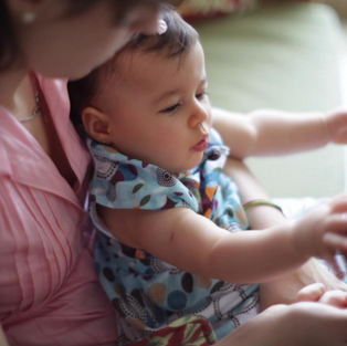


Several portables hard drivers were filled with a incredible amount of unpredictable real scenes of real life. A baby sneezing into a swimming pool, a father in panic with heavy diapers, dizzy girls laughing in a very friendly moment and mothers talking confidences are examples of a vivid images captured of real life.
The hard work were in hands of an expert and sensitive editor and creative director that had to organize all of that rich visual footages in short emotional storytelling pieces, of 30 seconds each.
The design toolkit created to receive this live action material were amazingly simple and very smart animated.
Colourful backgrounds, shades and sparkles wereoverlaid on those footages of real situations. Slapstick gags were made through audio loopsand melodic female vocals. Also the logo was intergraded to those scenes inorder to give it more personality. Animations fused the logo into the liveaction gestures and gave it live through funny movements such as breath, itchy, frolic, bounces and shakes. The logo GNT was also slightly redesigned. The original design lost its mooned ring as means to get a strong imprint and to be better integrated to overall communication. Furthermore that change gave abetter legibility on reductions, solving a previous logo snag. The outcome is a “GNT with you”.
Diretora de Marketing: Ana Maria Geminiani
Gerente de Pesquisa: Giani Scarin e Daniela Martins
Gerente de Criação: Manuel Falcão
Coordenador de Criação: Ricardo Moyano
Design Thinking leader: Márcio Leite
Designers: Ricardo Moyano, Rodrigo Leme, Leon Vilhena, Celina Arsalanian, Tomate. Produtora responsável pela captação das imagens: Margarida Flores e Filmes / Diretor: Paulo Vainer
Aprovação: Letícia Muhana (Diretora do canal GNT) e Jorge Espírito Santo (Gerente Artístico e de Conteúdo/GNT)


Comentários